THE ARTIST BEHIND THE PRINT: Nate Collier on One Year of Cue the Record
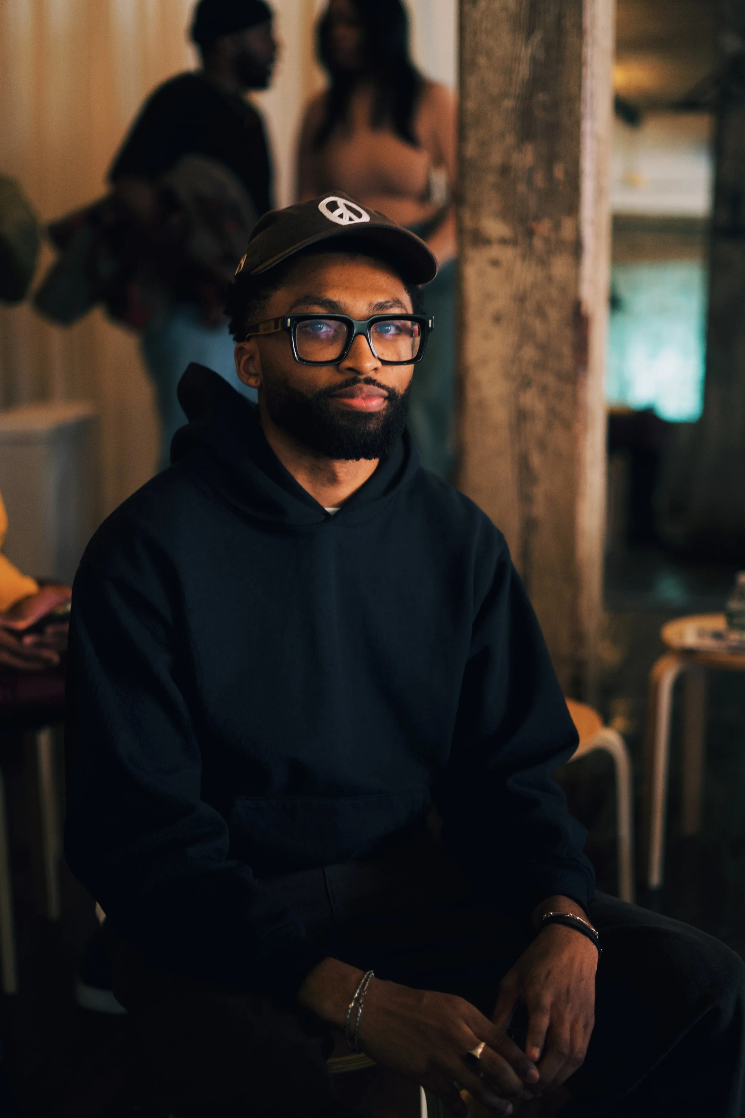
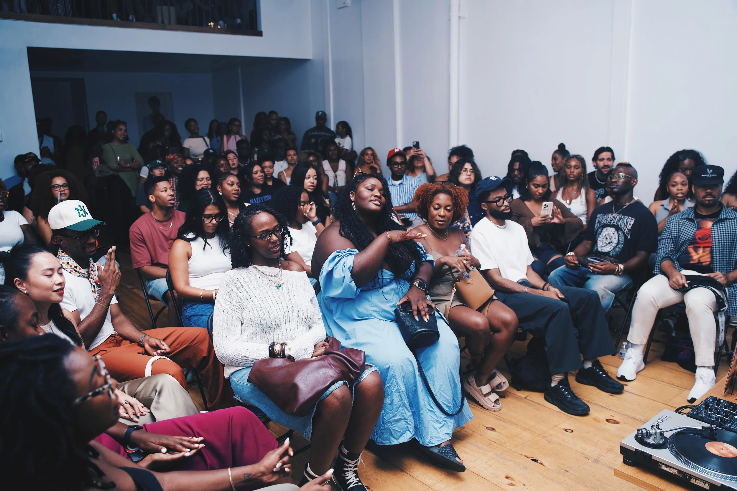
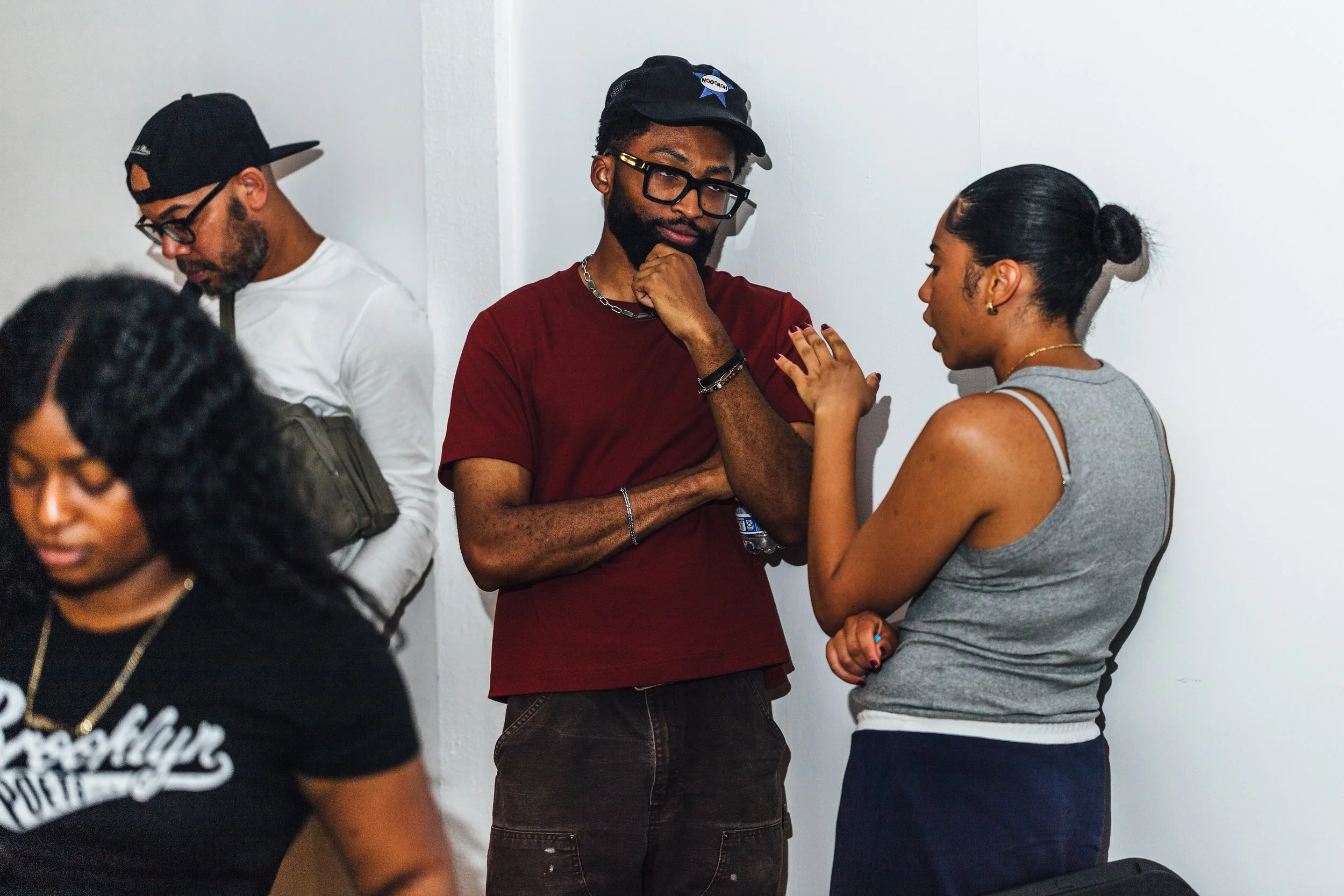
From the outside, Cue the Record might look like a simple listening series, but if you’ve been in the room you know it’s become something way deeper. Over this first year, what started as a shared love of vinyl slowly turned into a community with its own rhythm: new faces, returners, conversations that spill past the last track and moments that remind you why music brings people together in the first place. And woven into that journey has been Nate Collier.
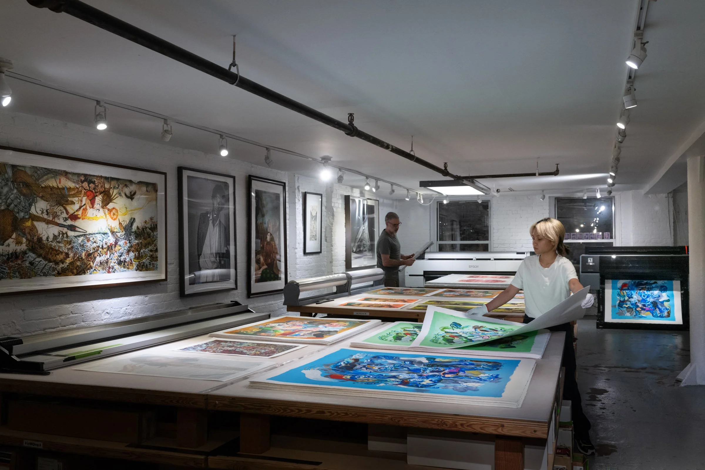
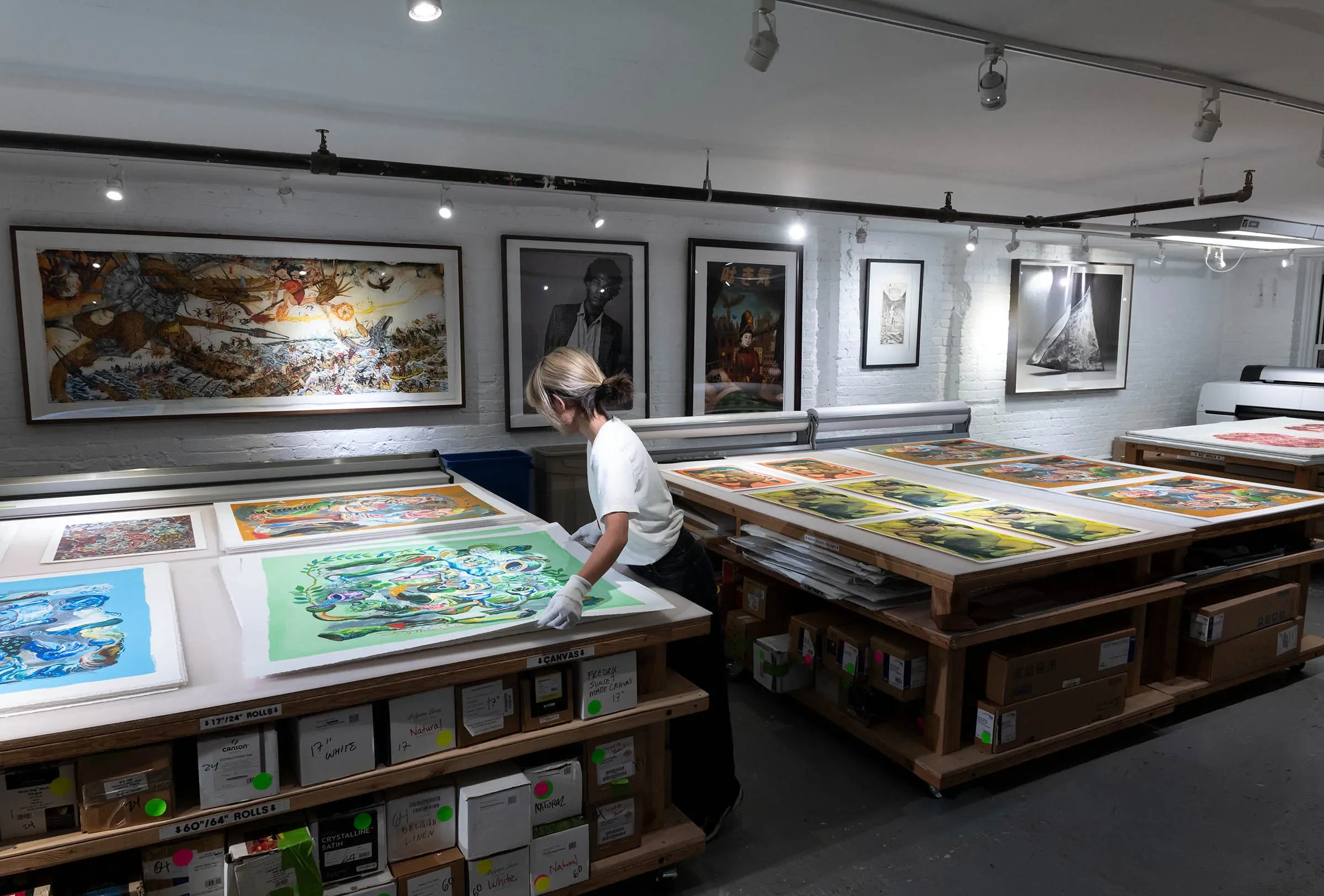
If you’ve attended a session, chances are you’ve crossed paths with Nate. He’s been supporting Cue the Record since before we fully understood what we were building, and it felt almost inevitable that he is the person to help us honor this first year in a tangible way. That’s how our first ever physical drop came to life.
We sat down with Nate to talk about his art, his connection to CTR, and what it meant to translate a year of listening into a single piece.
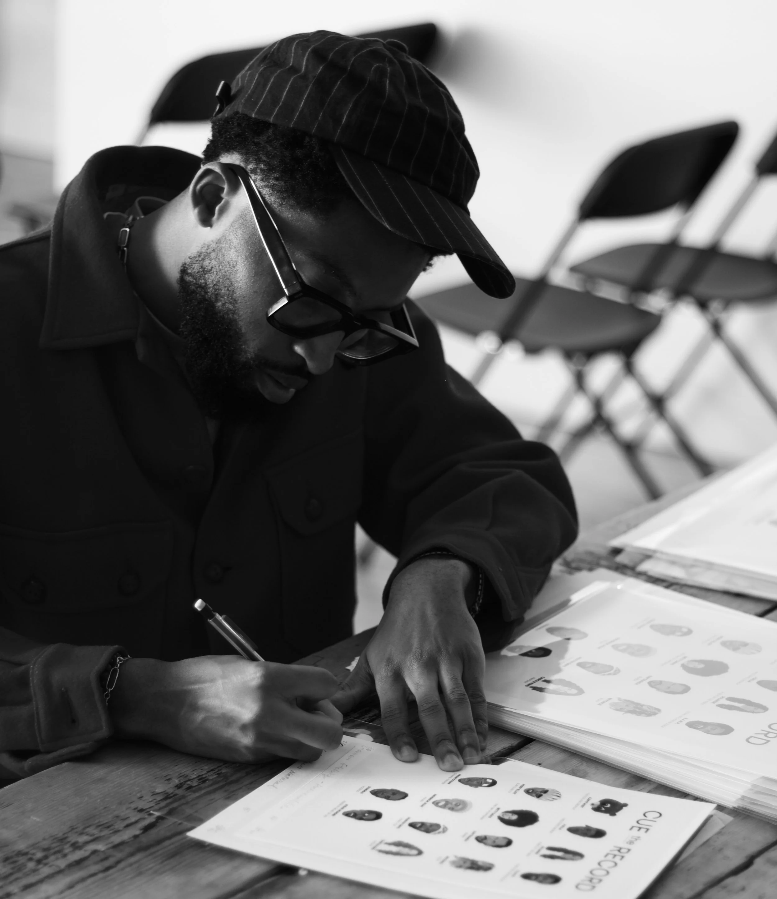
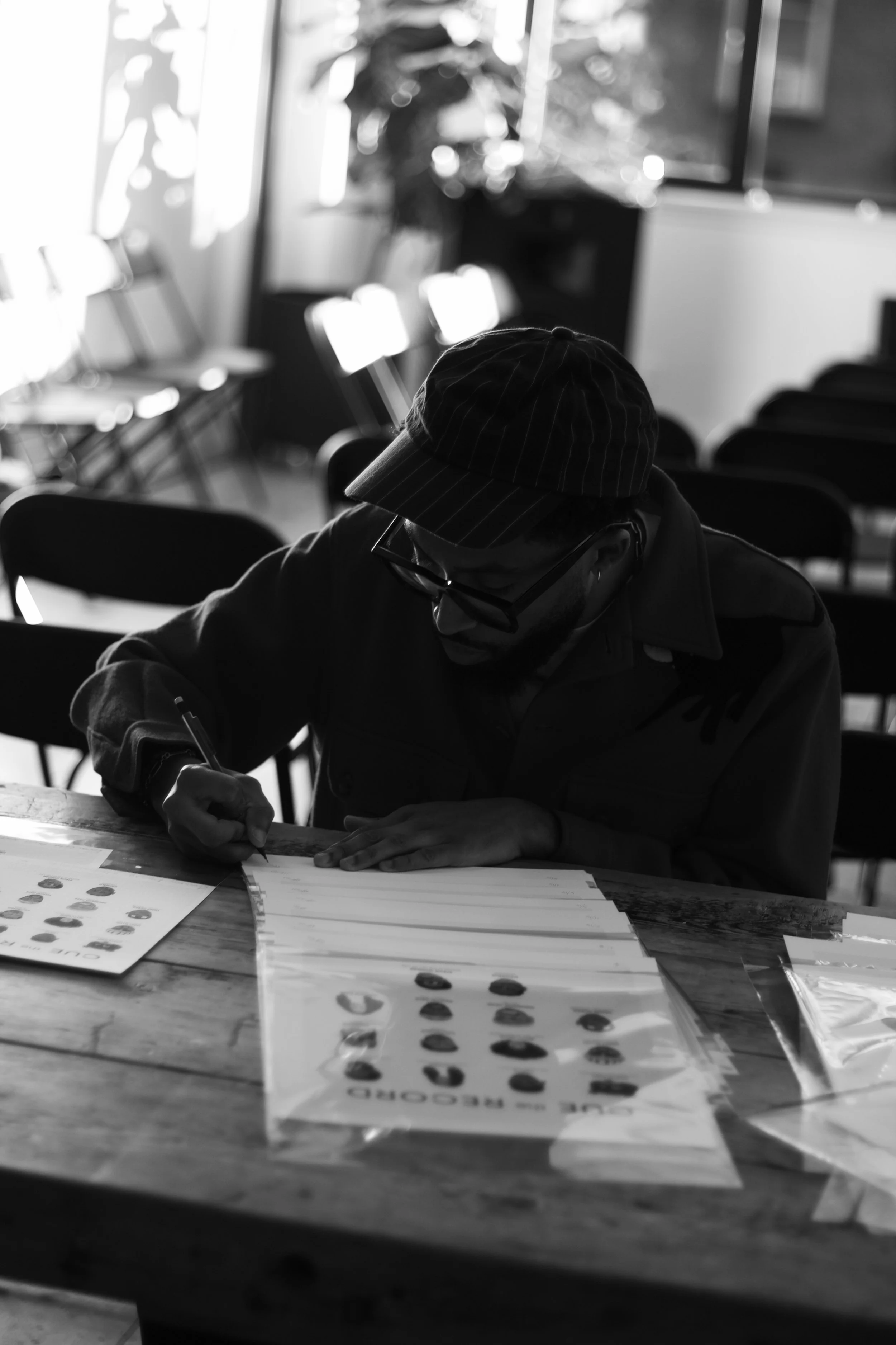
Nate signing the limited edition 1-year prints.
Sem: So Nate, how did you first get into illustration?
Nate: I first got into illustration in 2020 when I bought my first iPad. I’ve always loved drawing, and I wanted to expand my skills into digital art. During the pandemic, I decided to make a career pivot into the fashion industry, and I saw this tool as a way to better present my sketching and design skills. The more I used it, the more I explored all of its creative possibilities, and it eventually became like my daily sketchbook. I started with fashion sketches and then expanded into digital portraits. The transition from traditional to digital art wasn’t easy at first; there are a few things you have to relearn when you’re sketching with a stylus after spending years with a pencil and paper. But once I found some consistency, I was able to improve and develop my own style.
Sem: How would you describe your artistic style?
Nate: My artistic style consists of clean, sharp lines. I like to go for a polygonal look and use round, softer shapes only when I feel it’s necessary. When it comes to fully rendering my illustrations, I like to look at painting like connecting pieces of a puzzle. Understanding light and its placement is the most important part when you’re defining objects in a painting. So, I like to make that more obvious by color blocking my illustrations so you can clearly see the variety of tones that exist depending on how and where the light hits the subject.

Sem: How did you first connect with Cue the Record?
Nate: I first connected with Cue the Record, getting to know Sem and Mustafa through our shared love of music and, more specifically, vinyl. I met both through separate vinyl-related events, and their passion for music, community, and curating a safe and comfortable space for music lovers was clear even before CTR’s first session. Getting to know them made it easy to support them from the very beginning.
Sem: What has Cue the Record meant to you over the past year?
Nate: Cue the Record has been a big part of what’s made Brooklyn feel like a home for me. I hadn’t been in Brooklyn very long at the time before the first session, and I’d been looking for more spaces to make connections and find community. Cue the Record has provided that space for me to meet people with that same love and passion for music, and I’ve found that helpful for me to make those connections and build great relationships. Cue the Record has also improved my relationship with music in that it’s encouraged me to dive deeper and educate myself on, not just the new music I discover, but the old music I’ve known and loved.
Sem: Was there a detail or moment you wanted to make sure you captured?
Nate: I wanted to capture each artist in a way that I felt best represented them at the time of the project being highlighted. I appreciate when artists have certain details they incorporate into their look, depending on the project they're working on. It serves as an additional visual representation of the music, and it gives a glimpse into where the artist was creatively. For me, it’s cool when I can look back and pinpoint the album the artist was working on just from a photo of them from that time. One of the more notable examples of this would be Kanye’s bear mask, which I pulled from The College Dropout album cover. Or Frank Ocean’s red and white headband he sported for live shows and photoshoots during the time he released Channel Orange. I feel like key details like these are special and can lend a lot to the experience of an artist, so I wanted to make sure I included those details where I could.
Sem: What did you learn from illustrating a full year of sessions?
Nate: As far as the creation of the piece, I learned a lot about capturing the essence of an artist. To add on to my previous point, the goal was to illustrate each artist in a way I felt best represented them at the time of the highlighted project. So, I put a lot of emphasis on choosing references that I felt showed the right emotions of the artist. With artists like Betty Davis and Anderson .Paak, or Stevie Wonder, for example, I often saw photos of them smiling, so I felt like it was important to capture that side of them in the illustrations. Or for example, Missy Elliot; she was the blueprint when it came to creativity and innovation in Hip Hop and R&B in the 90s and early 00’s, and she always stood out. So, I wanted to make sure to capture her unique and bold style in her illustration and make her stand out.
Sem: What do you hope people feel when they see the print?
Nate: For those who have been to a session, I hope they can look at the artists and reflect on their personal experiences with Cue the Record. For me, creating this piece was very therapeutic, and it allowed me a lot of time to reflect on my last year with CTR. I’ve been lucky enough to attend almost all the sessions, so I’ve built great memories that I can look back on each time I look at this piece, and I hope others can do the same. I also hope people see the amazing variety of artists that Cue the Record highlights and are encouraged not only to attend more sessions but to dive deeper into artists they might not know as well, as CTR has influenced me to do.
. . .